Style Me Pretty: The Power Of Colours For 50+ Women
Choosing the right colours for your daily outfits is a winning strategy that becomes even more important in midlife. As our own natural colouring starts to fade with our hair getting grey and skin becoming less energized and bright, wearing the wrong tones can turn our appearance from charming to disastrous and it can also affect our own mood as well as have a strong impact both on the message that we send to others.
The right mix of ‘base’ and ‘highlight’ colours
If you feel like wearing bright colours belongs to your youth, think again. “Many people believe that as you age you should morph into darker, more sombre colours, but the opposite can be true. Brighter colours are youthful and fun-loving, uplifting and dynamic, whereas dark shades can be incredibly ageing and draining”, states Jules Standish, personal stylist and colour consultant, in her book Mindful dressing.
Black is generally believed to be slimming, easy, chic, and elegant, but it can also be incredibly detrimental to our looks; close to the face, it drains and ages us and highlights all the negatives – wrinkles, lines and dark shadows under the chin and around the eyes.
Being mindful about your colours. Changing your wardrobe doesn’t have to mean wearing bright green from head to toe and imitating a lime – she advises -. Nor does it mean ditching everything in your wardrobe and starting again. It means adding some colour into your outfits to start feeling happier and healthier, lifting your moods and your general well-being and looking your best.
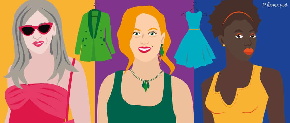
While black can certainly be a part of your outfits, you should consider adding brighter colours as well. For stylist, author and photographer Geneva Vanderzeil, a wardrobe winning combination is to have a mix of base or neutral tones for essential garments such as suits, blazers, pants, skirts and jackets in black, white, grey, khaki, navy, beige, tan and camel. A basic palette, inspired by nature, that colour expert Lee Eiseman calls otherwise ‘crossover colours’ perfect when combined with brighter tones.
When the core of your outfit is in ‘base colour‘, you can liven the overall lookup with accessories like shirts, scarves, shoes, bags and hats that are in so-called accent or highlight tones. Different shades of ‘highlight colours‘ such as pink, orange, yellow, red, lighter blues, purple and brighter greens are perfect to give a livelier, happier look. The important thing is to mindfully combine ‘base’ and ‘highlight’ colours into a harmonious whole.
What colours communicate
Several studies show that colours affect our mood and raise different psychological reactions in those around us. Tonalities in the red area of the colour spectrum are known as warm colours that evoke emotions ranging from feelings of warmth, joy, happiness and comfort to those of power, anger and hostility. The tones on the opposite side of the colour spectrum – blues, greens and purples – are known as cool colours. They are calming, but also create feelings of sadness or indifference.
Knowing that every colour has its positive and adverse aspects allows us to be more mindful and consciously aware of our colour choices and what they are communicating – suggests Karen Haller in The Little Book of Colour-. Whatever colour you wear will influence how you think and feel and how other people respond to you, so why not pick colours that support you in a positive way?
According to Haller, red is the colour to wear when you want to get noticed and appear sassy and in control. It comes across as stimulating and courageous, but on the adverse side, also aggressive and demanding. Yellow boosts your self-confidence and transmits happiness and optimism but can easily overstimulate the nervous system. Orange is a playful, fun colour that makes you come across approachable, but might also compromise your credibility. Consider not to use orange for very serious occasions.
Brown is a calm, grounding colour and the person wearing it is seen as reliable. It is not very energizing, though, so it is not ideal for occasions where high efficiency is needed. Different shades of blue are calming and help in concentration and focus. Dark blue is seen as authoritative – thus not ideal for collaborative meetings, whereas a person wearing turquoise comes across as creative and open to communication. Green is a refreshing, harmonious and reassuring colour that has many shades: brighter ones such as lime are full of energy – great for sales – and darker shades of green help people feel at ease. Purple is a colour related to spirituality, wisdom and composure and is great for moments of meditation. It also conveys regal luxury and quality. Grey, on the other hand, is a neutral tone and perfect when you want to melt in the crowd or communicate impartiality, explains David Zyla, Emmy-Award-winning stylist and author of Color Your Style.
Which ‘colour-type’ are you?
When choosing the tonalities of the highlight and base colours to use, you should also consider your basic colour type. There are four main groups – spring, summer, autumn and winter – that are determined based on your skin tone and eye and hair colour. Summer and winter women typically have cool skin tones whereas spring and autumn ladies have a warmer skin colour. According to personal stylist Audrey Coyne the quickest way to evaluate whether you belong to a cool or warm group is by looking at your wrist and your veins: if they are blue, you are most likely in the cool group. If they seem greenish, your tones are warm. But there are fine-tuned nuances and 12 subgroups based on dominant and secondary characteristics, so for a thorough analysis, it is better to turn to a professional.
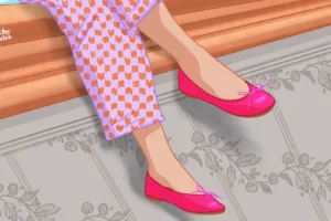
Each of the four seasons has a palette of suitable colour tones that enhance the look and give a natural glow, bringing out our natural beauty. Now, what to do, if you really love a shade of red that really does not fit with your skin tone? If you still want to wear the colours that you love, but they don’t compliment your skin, consider wearing them on the bottom, not on top, or in accessories that are not next to your face, such as shoes or bags, suggests Audrey Coyne.
Colourful role model
A fabulous role model of a powerful user of colour at any age is the editor-in-chief of Vogue America magazine and artistic director of Condé Nast Publications, Anna Wintour. She does not shy away from bright tonalities and prefers colour and pattern over muted greys and black. Despite the notion that fashion pros love to wear black, the editor is almost always seen wearing colour and loves bold patterns. If she can wear all those bright colours in her seventies, so can you!
Like this article? Sign up to our newsletter to get more articles like this delivered straight to your inbox.
Related Posts